

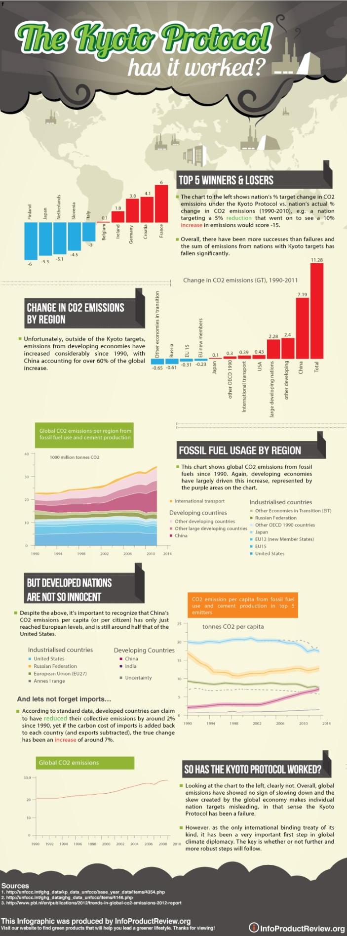
Taking CO2 emissions data from the UN and PBL, this infographic from InfoProductReview aims to depict the successes and failures of the Kyoto Protocol since its inception in 1997 (if you weren’t already aware, the first phase of the treaty expired in 2012!).
It shows that while there have been some tremendous successes amongst nations with Kyoto targets (mainly developed nations), these successes have been more than offset by nations outside of the treaty, with China accounting for over 60% of the global increase in CO2 emissions since the early 90s.
On the other side of the coin, it also shows how we cannot take such statistics at face value (the surge in fossil fuel usage outside of the treaty is largely the result of demand for cheap goods in the developed world) and ultimately, how the metrics upon which the Kyoto Protocol was built are flawed.
The goal of the infographic is to raise awareness and promote further cooperation between nations with respect to greenhouse gas concentrations in our atmosphere.
(Click on the Image For Full View)
Source: infoproductreview