

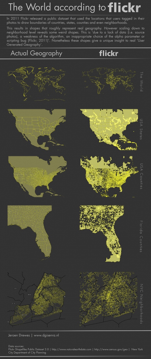
In 2011 flickr released a public database that used the locations that users tagged in their photos to draw boundaries of countries, state, counties and even neighborhoods. This results in shapes that roughly represent real geography.
However scaling down to neighborhood level reveals some weird shapes. This is due to a lack of data (i.e. source photos), a weakness of the algorithm, an inappropriate choice of the alpha parameter or scripting bug (Flickr, 2011). Nonetheless these shapes give a unique insight to real user generated geography.
(Click on the Image For Full View)
Source: dgisenra