

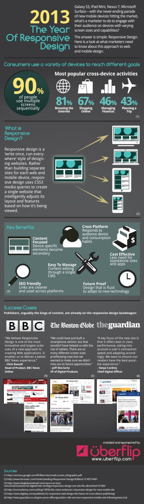
Galaxy S3, iPad Mini, Nexus 7, Microsoft surface- with the never-ending parade of new mobile devices hitting the market, what’s a marketer to do to engage with their audience on devices with varying screen sizes and capabilities?
The answer is simple: responsive design. Here is a look at what marketers need to know about this approach to web and mobile design.
Responsive design is a ‘write once, run everywhere’ style of designing websites. Rather than building separate sites for each web and mobile device, responsive design uses CSS3 media queries to create a single website that intelligently adjusts its layout and features based on how it’s being viewed.
(Click on the Image For Full View)
Source: uberflip